I promised you a sleep chart, and here I deliver unto you a sleep chart.
I made several decisions with this sleep chart that might not, at first, make obvious sense. Like, for example, starting the week on a Wednesday.
(Here it is in PDF: Sleep Chart 11-14-07 — 11-21-07-1. Clean templates are at the bottom of the post)
To tell you the truth, I don’t remember why I did that. I know I had a reason at the time, and it seemed to be a good one. Possibly because I wanted to show how far my sleep wandered between Thursday and Tuesday (seeing as I normally taught Thursdays and Tuesdays).
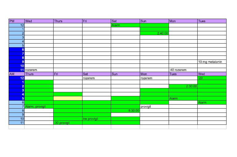
The other potentially less than obvious choice was the way I arranged the hours. The top of each column starts with 12 pm, so we have the day change (aka night time) in the middle of the chart. I wanted to show my sleep patterns, and the best way to look at those seemed to me to have the time in which I ought to be asleep showcased as a solid block.
I made the night time hours a darker blue and the daytime hours pale blue, so I could tell at a glance if I was sleeping at the appropriate time of day. Green was for when I actually slept.
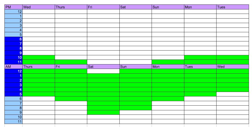
In a “normal” pattern, like the one to the left here, the green would have been closer to the center of the chart. That’s pretty much my ideal pattern.
In my actual pattern, well, the green kinda slops all over the place, filling up morning hours and dripping over into the afternoons some days. Except, of course, for the days when I had to be up in time to teach or hold office hours. In which case, those green sections are looking sadly anemic. (Four hours! Can you imagine being coherent enough to rein in a classroom of resentful 18 year olds on four hours of sleep? Gah.)
The one yellow block in my actual chart is to indicate restlessness. The white block in the middle of the green indicates me being stuck awake for an hour. When I used an alarm to wake up, I wrote that down. When I took a medication, I wrote that down. When I got up to go to the bathroom, I wrote that down, too (bw = bathroom waking).
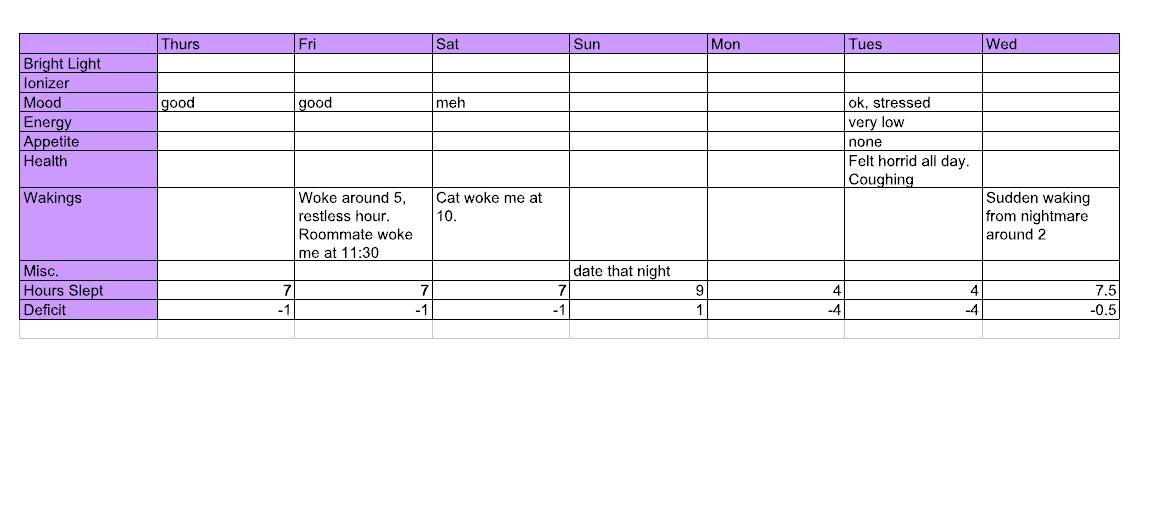
And here’s the addendum to that chart, which I kept on the same page.
I kept track of my hours of sleep debt at the bottom there. That week adds up to 10.5 hours of sleep debt, assuming 8 hours of sleep a night is the norm. It’s no wonder my charts made an impression on my doctor – they made it pretty clear that my sleep was crap.
If you’d like to try charting your own sleep, feel free to appropriate my templates. Or improve on them. Just, if you improve on them, please give me a copy, too!
- Sleep Chart Spreadsheet (google spreadsheet)
- Sleep Chart(.doc)


